
Build a Blazor WebAssembly LOB App Part 4: Make it Blazor-Friendly
We don't need no StateHasChanged...
Part of the series: Blazor and EF Core
I built the Blazor WebAssembly EF Core Example application as a learning tool and starting point for line of business applications. I wanted to go beyond a simple “Hello, World” demo and create an application that implements many features often found in line of business apps, like filtering and sorting, auditing and concurrency resolution. To get started with the application, visit the repo then follow the instructions.
JeremyLikness/BlazorWasmEFCoreExample
This post covers some refactoring I did to the original implementation. After a code review, I learned about some ways to simplify the code and improve performance at the same time. If you haven’t read the previous posts, you can start here:
Describes a fully functional real-world project built in Blazor WebAssembly with EF Core that demonstrates authentication, logging, shadow properties, auditing, optimistic concurrency, entity validation, paging/sorting/filtering and more.
A New Beginning
“You’re working against Blazor,” said Javier during our meeting to review the Blazor project. “You should never have to call StateHasChanged().”
The first code smell I encountered writing the sample app happened when I created GridControlsBase (no longer part of the project) and implemented the IContactsFilter interface as GridControls. Although the same instance was shared throughout the application via dependency injection, by default a parent component has no way of knowing when the object properties are mutated by a child component.
My original solution for this was to:
- Create a custom event
- Write extra code to register for the event
- Ask Blazor to re-render by calling
StateHasChanged()when the event is fired - Implement
IDisposableto unregister the event and avoid memory links when the component goes out of scope
It turns out I was working harder than I had to. After a code review with the Blazor team, I set out to make things right.
Respond with Responsiveness
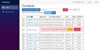
In addition to refactoring code, I wanted to address responsive design. Blazor is responsive out of the box and provides a powerful set of tools with Bootstrap 4 by default. I didn’t build the original app with responsiveness in mind, so I took advantage of refactoring to fix it. The pages to view, edit, and add contacts all render fine across different resolutions. Here is an example of what it looks like viewing a contact and performing the “delete” action on a mobile device.
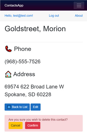
All contact information is fake and was generated by a random algorithm
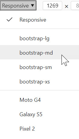
The problem was with the grid. The original application became unreadable on smaller screen sizes. To fix this, the first thing I did was switch from using a <table> to a fluid <div> and take advantage Bootstrap’s responsive grid system. The Developer Tools for both Edge and Chrome allow you to emulate certain devices to test how your website will appear. I added four custom emulators that map to Bootstrap’s responsive classes by setting the appropriate width.
The grid system will automatically update based on the device size. The classes include:
| Device | Width | |
|---|---|---|
| xs | Phone | < 576px |
| sm | Tablet | < 768px |
| md | Laptop | < 992px |
| lg | Desktop | < 1200px |
| xl | “Big” | > 1200px |
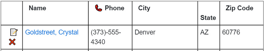
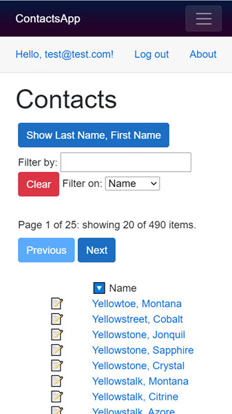
The breaks are based on the pixel width, so a phone in landscape may end up at a higher level than a phone in portrait. Some phones are high resolution and may render more content. The first thing I set out to do was handle the main columns in the grid. Here is the full grid:

On a smaller screen size, I dropped the largest column (street address):
The edit/delete icons end up wrapping and stacking, which is fine because the phone column wraps too. Finally, for the lowest resolution I just show the edit button and the name:
The filtering still works, and if the user wants to see the other fields, they simply tap the name to navigate to the view. From there, they can also edit or delete.
The grid ends up rendering like this:
<div class="container-fluid contacts-grid">
<div class="row">
<div class="row contact-detail">
<div class="col-4 col-sm-1 text-right">
<a title="Edit" href="/edit/21">
📝
</a>
<span title="Delete" class="d-none d-sm-inline clickable red">
❌
</span>
</div>
<div class="col-8 col-lg-2 col-sm-3">
<a href="/View/21" alt="View Details" title="View Details">
Likness, Jeremy
</a>
</div>
<div class="d-none d-sm-block col-lg-2 col-sm-2">
(555)-555-6228
</div>
<div class="d-none d-lg-block col-lg-3">
321 The Yellow Brick Road
</div>
<div class="d-none d-sm-block col-lg-1 col-sm-3">
Redmond
</div>
<div class="d-none d-sm-block col-sm-1">
WA
</div>
<div class="d-none d-sm-block col-sm-2">
13579
</div>
</div>
</div>
The default “span” for the edit control is 4 out of 12 or 33% of the space. At the small size, it changes to take up just 1/12th of the space. The name field defaults to 8 out of 12 or 75% of the space. At the small size it shrinks to 3 out of 12 or 25%, and on large screens it is 2 out of 12 (1/6th). These numbers were computed in conjunction with the remaining columns. For example, looking at city, d-none means by default it doesn’t show. The d-sm-block makes it appear starting at the “small” size, and the other modifiers determine how many columns it spans. The street address only appears at the large size.
I use a separate control for the header and the detail rows. To ensure they share consistent widths, I created the ColumnService class. It is simply a container for shared column information. You may decide it makes more sense to implement it with constants. My rationale for using methods was in case I needed to perform calculations.
The final effort was around the filter, name toggle, and paging controls. I simplified the paging by converting the links from buttons to anchor tags that are styled like buttons and use simple href links. Then, I wrapped the controls in rows and columns and experimented with different screen sizes. My goal was to keep the controls close to each other while providing enough space to minimize wrapping.
Links
There were several places in the application that I injected NavigationManager to call from a button click event. Although some controls like “edit” redirect to a new page and require the navigation manager, most of the pages didn’t really need the extra reference. I converted those to use anchor tags and direct links instead of button click events. I’m a fan of simplifying whenever possible!
Cascading Values and Parameters
The challenge I mentioned earlier is how to detect changes to the filters and sorting when the child components manage the UI and the parent control is what fetches the data. It turns out that Blazor has a mechanism designed specifically for this scenario: cascading values and parameters. A CascadingValue is used to define data that flows down to all children. A child component that wants to “opt-in” can define a CascadingParameter to consume the data. If the data changes, Blazor’s built-in change detection will automatically update the child components. The one caveat is that data can only flow down: in other words, mutating properties in a child won’t propagate to the parent. That’s not a problem! We just need to coax the parent to make the change for us.
The GridWrapper control is defined like this:
<CascadingValue Value="this">
    @ChildContent
</CascadingValue>
@code {
    [Parameter]
    public RenderFragment ChildContent { get; set; }

    public int DeleteRequestId { get; set; }

    [Parameter]
    public EventCallback FilterChanged { get; set; }

    [Parameter]
    public EventCallback<int> DeleteRequested { get; set; }
}
Instead of cascading a simple value, it references itself. The @ChildContent is where child controls go. In the app, this is where the filter, name toggle, paging and grid controls are defined. To understand how it works, let’s look at two flows. First, we’ll tackle a filter change.
Here how the wrapper is defined in the ListControl component:
<GridWrapper @ref="Wrapper"
             FilterChanged="async () => await ReloadAsync()"
             DeleteRequested="id => Wrapper.DeleteRequestId = id">
The @ref statements allows ListControl to reference the component and interact with it. Notice that the FilterChanged event causes a reload. How do we trigger that event? The answer is in the TextFilter control. The component references the grid wrapper by defining a cascading parameter:
[CascadingParameter]
public GridWrapper Wrapper { get; set; }
When the timer fires to debounce input, this method is called:
private async void NotifyTimerElapsed(object sender, ElapsedEventArgs e)
{
    timer.Dispose();
    timer = null;
    if (Filters.FilterText != filterText)
    {
        Filters.FilterText = filterText.Trim();
        await InvokeAsync(async () => await Wrapper.FilterChanged.InvokeAsync(this));
    }
}
After mutating the filter, the FilterChanged callback on the wrapper is invoked. You can look at the property change logic for the filter column for another example. In this case, the timer event may fire on a separate thread from the UI. The InvokeAsync wrapper dispatches back to the UI thread so that Blazor can re-render components as needed.
For another example, consider the delete flow that starts in the ContactListRow component:
@if (CanDelete)
{
    <span @onclick="async () => await DeleteRequestAsync()" title="Delete"
            class="d-none d-sm-inline clickable red">
        ❌
    </span>
}
To only allow one row at a time, CanDelete is defined like this:
public bool CanDelete => !DeleteConfirmation &&
    (Wrapper.DeleteRequestId == 0 || Wrapper.DeleteRequestId == CurrentContact?.Id);
If the user already sees the confirmation dialog, the delete icon shouldn’t render. It also shouldn’t render if the confirmation is open on a different row. Assume the delete icon is visible. What should happen when it’s clicked? Here is code that won’t work as planned:
public void DeleteRequest()
{
    DeleteConfirmation = true;
    Wrapper.DeleteRequestedId = CurrentContact.Id;
}
The dialog flag is set, show the dialog shows, but the delete icons won’t disappear. Remember, values don’t propagate up. They only cascade down. No problem! Instead, we invoke a callback on the wrapper:
public Task DeleteRequestAsync()
{
    DeleteConfirmation = true;
    return Wrapper.DeleteRequested.InvokeAsync(CurrentContact.Id);
}
The parent ListControl defined how the callback is handled like this:
DeleteRequested="id => Wrapper.DeleteRequestId = id"
This sets the id at the top level, so all the children re-evaluate, and the result is that the delete icons disappears from other rows.
As a final example, look at the Pager component. The component defines the cascading parameter, but never references it. Why? Simply defining the parameter allows the component to “opt-in” to Blazor’s change detection and automatically re-render the parts of the pager that may be affected by other operations, like the filter changing (you may filter down to a single page). You can comment out/remove the property from the control and run the app to see what a non-responsive pager looks like.
After that round of refactoring, I was able to let Blazor handle the heavy lifting for almost everything. I still had a problem, though. Unless I called StateHasChanged() before rendering a new page of contacts, the grid would “remember” the state of the delete prompt. In other words, I could click “delete” on a contact in row three, then navigate to the next page, and the same row would render with the confirmation dialog showing, even though the contact information changed. What’s up with that?
Databinding with Reusable Controls
It turns out that StateHasChanged() is expensive and would destroy the component tree when the contact list is empty, forcing Blazor to render a new set of components. When I removed the call, Blazor efficiently reused the existing component. This is a behavior it’s important to take note of:
Blazor may reuse the same instance of a component for databinding.
This is great for performance, but it requires some nuance. In my case, the DeleteConfirmation flag wasn’t getting reset when the new contact was bound. This was an easy fix. I simply detect when the databinding updates and reset the state. Blazor provides a simple override that is called when parameters change. For the row component, the code looks like this:
private int _lastContact = -1;

protected override void OnParametersSet()
{
    if (CurrentContact != null && CurrentContact.Id != _lastContact)
    {
        _lastContact = CurrentContact.Id;
        DeleteConfirmation = false;
    }
    base.OnParametersSet();
}
💡 Tip: one way to think about databinding between objects in Blazor is to consider anything marked with
[Parameter]as a binding property. Thinking in terms of XAML databinding, the component is like aDependencyObject, and properties marked with[Parameter]are dependency properties. Instead of implementingINotifyPropertyChangedyou can simply overrideSetParametersAsyncand/orOnParametersSetAsyncto respond to databinding changes.
That’s it! When a new contact is assigned, I reset the confirmation flag. Done. I not only avoided StateHasChanged() but also managed to improve the performance of the grid.
Conclusion
I hope these changes improved the reference application and provide useful insights for your own projects. I will be building a Blazor Server app next, using all of the existing libraries “as is.” I plan to follow-up after that with a Model-View-ViewModel (MVVM) example. You may be surprised with my thoughts about MVVM and Blazor now that I’ve dug a bit deeper into the platform. More to come on that!
Regards,

Part of the series: Blazor and EF Core
- EF Core and Cosmos DB with Blazor WebAssembly
- Azure AD Secured Serverless Cosmos DB from Blazor WebAssembly
- Build a Blazor WebAssembly Line of Business App Part 1: Intro and Data Access
- Build a Blazor WebAssembly Line of Business App Part 2: Client and Server
- Build a Blazor WebAssembly Line of Business App Part 3: Query, Delete and Concurrency
- Build a Blazor WebAssembly LOB App Part 4: Make it Blazor-Friendly
- Build an Azure AD Secured Blazor Server Line of Business App