
From Angular to Blazor: The Health App
A reference application built with cross-platform WebAssembly-based Blazor.
Blazor is a .NET-based framework for building web applications that runs in the browser. It leverages C# and Razor templates to generate cross-platform, HTML5-compliant code that compiles to WebAssembly. The purpose of this post is to illustrate how to build a specific reference application using Blazor.
To see the application in action:
This post was written with version 3.2.0-preview1.20073.1 of Blazor.
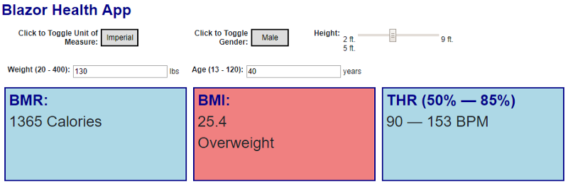
Over four years ago, I wrote a “ health app” in Angular.js 1.2.9. The goal was to create a very simple reference application that went beyond “Hello, world” and “todo list” to demonstrate features like dependency injection, reusable components, and databinding. The app itself features controls for the user to input information and computes Basal Metabolic Rate, Body Mass Index, and Target Heart Rate in real-time.
I later migrated the app to leverage a new version of JavaScript, ported it to Angular 2, and updated it to use Redux. I chose this app to port to Blazor because it is a lightweight Single Page Application with no external dependencies and makes a great clementines-to-tangerines comparison.
Source code for the Blazor app is available here:
I built the app quickly, so I did not write an exhaustive suite of tests. In the future I may refactor this app and leverage tests (probably once Blazor reaches a stable version) but for now I just wanted to get to something functional.
The Model
JavaScript and TypeScript are object-based rather than object-oriented so it’s possible to deal with functions directly (in object-oriented C#, functions typically live as methods on a class). In the JavaScript-based solutions I partitioned the user profile information (height, weight, age, etc.) from the set of functions for conversion between imperial and metric as well as the algorithms to output data. For Blazor, I simplified this and put everything on a single model.
public interface IModel
{
    bool IsMale { get; set; }
    bool IsFemale { get; set; }
    bool IsImperial { get; set; }
    bool IsMetric { get; set; }
    double HeightInches { get; set; }
    double WeightPounds { get; set; }
    int AgeYears { get; set; }
    void ToggleGender();
    void ToggleImperial();
    int Bmr { get; }
    double Bmi { get; }
    TargetHeartRate Thr { get; }
    double KilogramsToPounds(double kilograms);
    double PoundsToKilograms(double pounds);
    double InchesToCentimeters(double inches);
    double CentimetersToInches(double centimeters);
    string InchesToFeetDisplay(double inches);
}
My approach to interfaces is to be explicit, so while IsMale makes sense, so does IsFemale and I implemented both even though they are complementary. This is easy to model in the class for consistency and a developer can choose to bind to either property.
private bool _isMale = true;

public bool IsMale
{
    get
    {
        return _isMale;
    }
    set
    {
        _isMale = value;
    }
}

public bool IsFemale
{
    get { return !IsMale; }
    set
    {
        IsMale = !value;
    }
}
The algorithms are implemented in the getter methods and just return the result based on the current state of the model.
public double Bmi
{
    get
    {
        var bmi = (WeightPounds * 703) / (HeightInches * HeightInches);
        return Math.Round(bmi * 10.0) / 10.0;
    }
}
In Angular, you can create reusable transformations for data called “pipes” that are used to take input and display it with an alternative output. For example, you might create a pipe that converts a height expressed in inches to a height formatted with both feet and inches. In a large Blazor project, you could implement helper classes that are reused whenever the conversions are necessary. For this project, I simply implemented it directly on the model (it can always be refactored later to a different class).
public string InchesToFeetDisplay(double inches)
{
    var heightInches = inches;
    var sb = new StringBuilder();
    var ft = Math.Floor(heightInches / Globals.InchesPerFoot);
    if (ft > 0)
    {
        sb.Append($"{(int)ft} ft. ");
    }
    heightInches -= (ft * Globals.InchesPerFoot);
    if (heightInches >= 1)
    {
        sb.Append($"{(int)Math.Floor(heightInches)} in.");
    }
    return sb.ToString();
}
The model is shared by all components and represents the overall state of the application. Therefore, I register it as a singleton in Blazor’s Program class. I implemented an interface to facilitate the creation of mock classes for testing if necessary.
builder.Services.AddSingleton<IModel, MainModel>();Blazor uses Razor templates to define reusable components, and the model can be injected simply by providing the requested interface and the name the instance will be referenced as. This line can be read as:
Give me the registered implementation of
IModeland refer to it asModelthroughout this component.
@inject IModel Model
After building the model, I started working on the components. Each component is standalone and reusable (even though they are only used once in this app). I tackled the easiest one first: the toggle button.
A Toggle Button for Gender
The toggle button displays the current setting for the property, then toggles to the alternative when clicked. I did not abstract the concept of the toggle button because I only had two, but they are implemented the same way. First, the model is injected into the component as described previously. The template then calls methods on the model directly, so it looks like this in Shared\GenderToggle.razor:
<div class="unit">
    <div class="label">
        <label for="btnGenderToggle">Click to Toggle Gender:</label>
    </div>
    <div class="labelTarget">
        <button id="btnGenderToggle" @onclick="@Model.ToggleGender">@ToggleText</button>
    </div>
</div>
The classes are ported directly from the Angular apps. I dropped the CSS file in under the wwwroot folder which is for static assets.
Note the call simply invokes the toggle function on the model. There is a local property named ToggleText that is defined in C# code like this (in Angular it would likely be implemented as a pipe):
@code {
    string ToggleText
    {
        get
        {
            return Model.IsMale ? "Male" : "Female";
        }
    }
}
This is when someone says, “But Jeremy, you might have to display gender in other places. Why hard code it in the component?” The answer is that it was not reused, so this implementation worked out, but it will be easy enough to extend the model with a property named
GenderDisplayand use that instead.
In the main page, the component is dropped in simply by tagging it in the template:
<GenderToggle/>
That’s it! Now to see if the toggle works …
BMI: Example Output
The output components are straightforward because they simply display the properties that already exist on the model. For BMI, there is a further category based on the value that can be either underweight, normal, overweight, or obese (I don’t make these up, it’s a published standard). I decided to color code the tile based on the value and show green, pink, or red. The template looks like this:
@inject IModel Model

<div title="Body Mass Index"
     class="@BmiClass">
    <h1>BMI:</h1>
    <h2>@Model.Bmi</h2>
    <h2>@BmiTag</h2>
</div>
To simplify things, I created a class named the same as the category, so I simply apply the appropriate class in addition to the tile class to get the desired result. Here is the code for the component:
@code {
    string BmiClass
    {
        get
        {
            return $"{BmiTag} tile";
        }
    }
    string BmiTag
    {
        get
        {
            if (Model.Bmi >= 30.0)
            {
                return "Obese";
            }

            if (Model.Bmi >= 25.0)
            {
                return "Overweight";
            }

            if (Model.Bmi < 18.5)
            {
                return "Underweight";
            }

            return "Normal";
        }
    }
}
In general, components will detect when dependent properties change and automatically re-render the necessary elements as a result. However, when I published the first iteration of the application and clicked the toggle button, nothing happened … even though some of the equations are based on gender. What happened?
Change Notification
To the best of my knowledge, it looks like the change detection in Blazor is simple and scoped to the current component. When my toggle button updates the state of the model, the output components aren’t notified automatically. Fortunately, the base Blazor class for a component contains a method called StateHasChanged you can call explicitly to force it to re-evaluate properties. I added a method to the model for interested components to be notified when the state has changed:
void Register(Action callback);
I created a very simple implementation that stores callbacks and calls them in sequence when something changes. This is when I note that the implementation is primitive, and I didn’t write an “unregister” function. In this app, there is no need because the components are always present. In a larger application this could result in a memory leak if components are destroyed without registering, so for that case I would implement a dictionary with a token that could be used to unregister.
And this is when I also wonder, “Am I understanding the framework right, or did I miss something that is built-in to notify components already?” If you know the answer, let me know in the comments … otherwise I may create a simple library specifically to handle pub/sub for Blazor apps.
private readonly List<Action> registrations = new List<Action>();

public void Register(Action callback)
{
    registrations.Add(callback);
}

private void Changed()
{
    registrations.ForEach(a => a());
}
Next, I updated the properties in my model to notify on changes:
public double HeightInches
{
    get => _heightInches;
    set
    {
        if (value != _heightInches)
        {
            _heightInches = value;
            Changed();
        }
    }
}
In the last step I updated the output components to register for the notifications and raise the state change.
@code {
    bool registered = false;
    protected override void OnAfterRender(bool firstRender)
    {
        if (registered == false)
        {
            Model.Register(() => base.StateHasChanged());
            registered = true;
        }
        base.OnAfterRender(firstRender);
    }
}
After this, everything started working properly.
The Slider
Tackling the height slider was a bit more involved. It must do some extra lifting because I allow either imperial (U.S.) or metric measurements. Therefore, the slider must change its minimum and maximum range depending on whether metric (centimeters) or imperial (inches) are used, output the proper display value that is currently selected, and furthermore convert from centimeters to inches when updating the shared model.
Let’s dive in! The template is simple enough at Shared\Height.razor:
<div class="unit">
    <div class="label">Height:</div>
    <div class="labelTarget">
        @MinHeightText
        <input type="range"
               step="1"
               min="@MinHeight"
               max="@MaxHeight"
               @bind-value="@HeightAmt"
               @bind-value:event="oninput"/>
        @MaxHeightText
        <br/>
        @HeightDisplay
    </div>
</div>
The
@bind-value:eventinforms the data-bindings to refresh each time theoninputevent is fired. This results in the slider working as you slide it. Otherwise, it would only update after you release the slider.
The height on the slider may be centimeters or inches, but the model only has inches, so the value is initialized for the component and updated when the model changes.
private int _height;

protected override void OnInitialized()
{
    base.OnInitialized();
    _height = (int)(Math.Round(Model.HeightInches));
}

protected override void OnAfterRender(bool firstRender)
{
    Model.Register(() =>
    {
        _height = Model.IsImperial ? (int)Model.HeightInches :
            (int)(Model.InchesToCentimeters(Model.HeightInches));
        base.StateHasChanged();
    });
    base.OnAfterRender(firstRender);
}
I created a helper method to render the display height in the proper format and set up a property that displays the current height.
string HeightDisplay
{
    get
    {
        return RenderHeight(_height);
    }
}

string RenderHeight(int height)
{
    if (Model.IsImperial)
    {
        return Model.InchesToFeetDisplay(height);
    }
    return $"{height} cm.";
}
I created a Globals class for all fixed values such as ranges and conversion factors. The minimum and maximum properties work the same: they return the correct value based on the currently selected unit of measure that is bound to the slider range, and another property that converts them to display text. Here is the implementation for minimum height:
int MinHeight
{
    get
    {
        return Model.IsImperial ? Globals.MinHeightInches :
            Globals.MinHeightCentimeters;
    }
}

string MinHeightText
{
    get
    {
        return RenderHeight(Model.IsImperial ?
            Globals.MinHeightInches :
            Globals.MinHeightCentimeters);
    }
}
Next, the component “height” property has two functions. For read, it simply returns the component’s height regardless of unit of measure. When it is written to, however, it must either pass through the value of inches or convert the value from centimeters before updating the model.
int HeightAmt
{
    get
    {
        return _height;
    }

    set
    {
        if (value != _height)
        {
            _height = value;
            Model.HeightInches = Model.IsImperial ? value : Model.CentimetersToInches(value);
        }
    }
}
…and finally, the component is ready to drop in. You can see it works seamlessly even if you decide to change the unit of measure after you’ve adjusted the values.
Validated Text Boxes
Weight and age both use text boxes for input. For numeric input I have two helpers: first, the HTML specification which allows me to tag the field as numeric; and second, Blazor is smart enough to know that alphanumeric input can’t be transformed into an integer. I also want to make sure that the model is not corrupted with out of range values and show a visible indicator when the input is invalid.
This is the template for age at Shared\Age.razor:
<div class="unit">
    <div class="label">Age (@Globals.MinAge - @Globals.MaxAge):</div>
    <div class="labelTarget">
        <input type="number"
               class="@InputClass"
               @bind-value="@AgeAmt"
               @bind-value:event="oninput" /> years
    </div>
</div>
It keeps track of the error state and apply a class named error when the value is invalid.
bool ErrorState = false;

string InputClass
{
    get
    {
        return ErrorState ? "error" : string.Empty;
    }
}
Finally, the property on the component sets or clears the error state whenever it is updated and only informs the model if the age is within the valid range.
int _age;

int AgeAmt
  {
      get => _age;

      set
      {
          if (value != _age)
          {
              _age = value;
              if (value < Globals.MinAge || value > Globals.MaxAge)
              {
                  ErrorState = true;
              }
              else
              {
                  ErrorState = false;
                  Model.AgeYears = value;
              }
          }
      }
  }
The weight component uses very similar logic. This is one of those areas it may make sense to build a generic “range component” that handles this automatically, but it seemed like too much effort for just two components.
Deployment
Client-side Blazor produces a set of static assets that can be served from any web platform. The only caveat is that the web server needs to understand the appropriate MIME types. I hosted this sample app in an extremely inexpensive instance of Azure storage.
If you’re curious about the steps involved, check out:

Learn how to create automated builds and deployments for CI/CD of your open source WebAssembly projects (C, C#, Go, or Rust) on GitHub.
Summary
Building single page applications with Blazor is surprisingly simple. I enjoyed building the component and did not run into any surprises or strange behaviors or side effects. Working on this “mini-app” gave me enough insights to envision how a larger scale app would work. There are still caveats:
- Change notification is a must. The team purposefully did not implement
INotifyPropertyChangedto avoid being too opinionated, but you can create your own base class that does something similar. - I would love to see more built-in controls to make development easier, but on the other hand that’s the power of open source because anyone can decide to create a shareable library.
- Blazor is still in a very alpha state, so I don’t want to invest too much time and energy until it stabilizes to avoid breaking changes and rework.
- The payload to deliver an app is fairly large. Manageable, but large, so this needs to improve.
- I wonder if there will be support for dynamic module loading? We leverage that quite a bit in other front-end frameworks.
Overall, I was happy with the experience. Maybe I’m biased because I’ve worked with C# so many years, but as a major fan and experienced Angular developer I prefer the Blazor experience. It just feels more organized and straightforward. Obviously, I’ll need to tackle larger apps before having a more informed opinion. I plan to do a lot more with Blazor in 2019. Interested? Click here to get started.
Regards,

Related articles:
- Azure Cosmos DB With EF Core on Blazor Server (Blazor)
- Exploring Blazor (Single Page Applications)
- MVVM Support in Blazor (Single Page Applications)
- My New Role as Senior Program Manager for .NET Data (.NET)
- The Year of .NET Core, Angular, and Web API Design: 2018 in Review (Angular)
- Vanilla.js — Getting Started (Angular)